Interpreting Equity Distributions

Overview
Our range-vs-range equity distribution graphs are an excellent tool for visualizing which player has the stronger or nuttier range and the distribution of equity across each player’s range. Whether a player has mostly medium-strength hands or a more polarized mix of very strong and very weak hands has huge implications for their preferred betting frequency and size. These graphs display that information clearly and concisely.
On these graphs, the x-axis plots each player’s range from their lowest-equity hand, on the far left, to their highest-equity hand, on the far right. The y-axis plots the equity of each hand. The lines on these graphs always slope from the bottom left to the upper right. The things to pay attention to are: Which player’s line is above the other’s at various points on the x-axis and by how much.
Check out this article to learn more about equity distribution graphs📈
Range Matchup: Polarized vs. Condensed
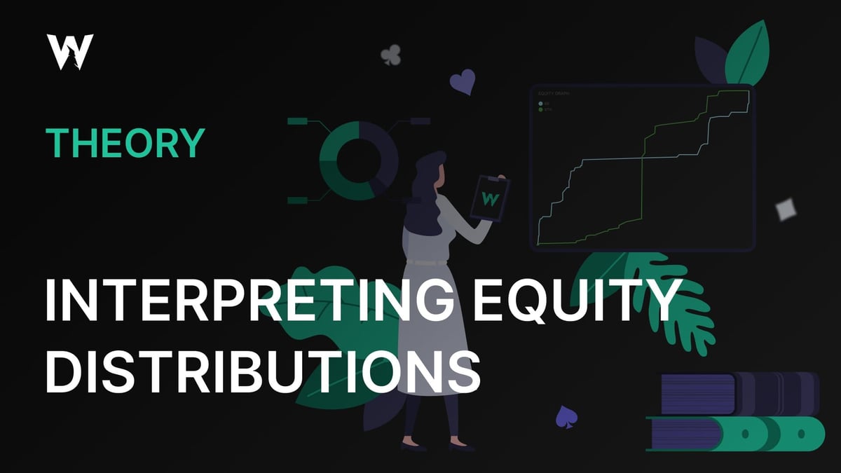
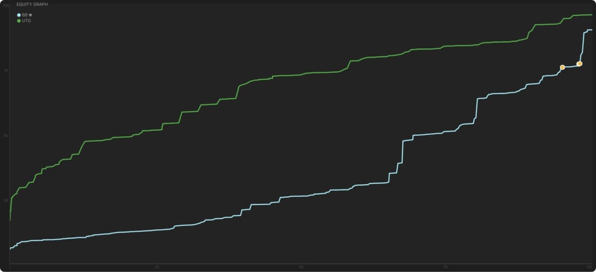
Take a look at the graph below, where the {{color: blue}}blue line{{/color}} represents BB’s equity distribution and the {{color: green}}green line{{/color}} BTN’s equity distribution. Which of these players has the more polarized range? How can you tell? What do you expect each player’s betting strategy to look like on this street? (I am deliberately not giving you the action that led to this distribution so you can practice deriving optimal strategy from the graph rather than from familiar patterns of previous action.)
BTN has the more polarized range here. Notice their green line is consistently well above or well below BB’s blue line, intersecting it only briefly in the middle, where the line slopes steeply upward. That means BTN’s hands are mostly very bad, with 0-15% equity, or very good, with 70%+ equity. That vertical stretch in the green line indicates BTN has no hands with 30-60% equity. The long, flat, horizontal section of the blue line represents medium-strength hands, with about 60% equity, predominating in BB’s range, with just a few very good or very bad hands at the extremes.
Knowing this, we should expect BB mostly to check. Those medium-strength hands do not benefit from betting, because they will only cause worse hands to fold and better hands to call. Their preference is to keep the pot smaller, get to showdown, and maybe induce some bluffs from BTN’s weaker hands.
BTN is the one who wants to bet. Their weaker hands can get folds from better, and their stronger hands benefit from making the pot larger. Given the magnitude of BTN’s advantage here, we should expect large bets, if the stack-to-pot ratio permits it.
This graph is from a 100bb cash game simulation between BTN and BB in a single-raised pot. After the BB checks and calls a 50% pot on an A♠T♥8♠ flop and a 125% pot bet on a 2♣ turn, they see the 6♥ river with the ranges shown on this graph.
As we predicted, the BB checks 97% of their range in this situation, and the BTN makes large bets with a polarized range, using all-in for more than 200% of the pot as their most frequent bet size.
This is an extreme example of polarization.
To arrive at such a distribution of equity, BTN had to take several polarizing actions (large bets on the flop and turn), BB had to take several condensing actions (checking and calling bets), and the board had to develop in such a way that very few of BB’s medium-strength hands improved. Had a draw come in on the river or the board paired, the distribution would have not have been so dramatic.
Quiz: Match the Graphs to the Flops
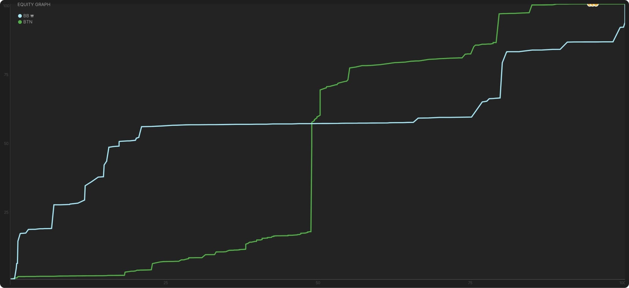
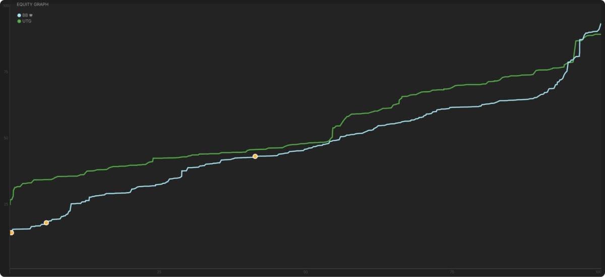
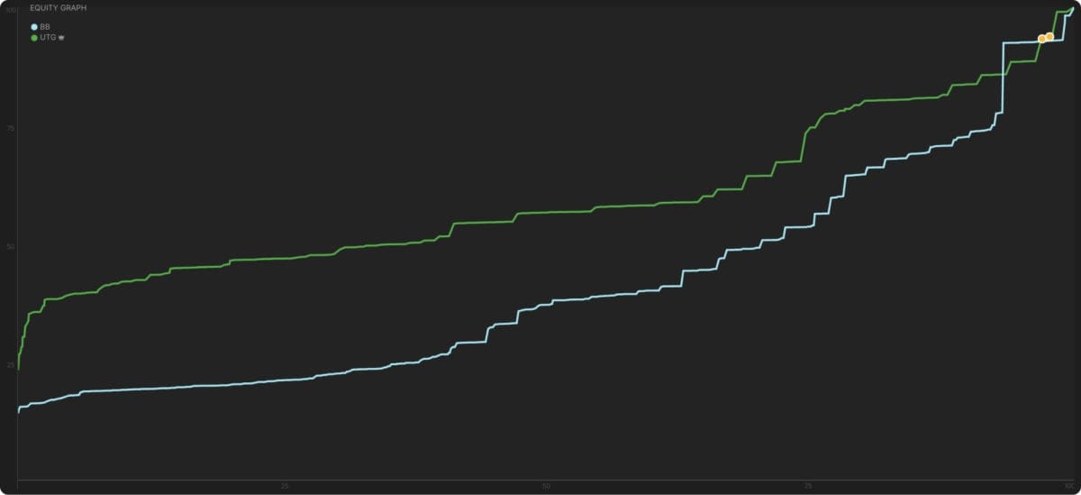
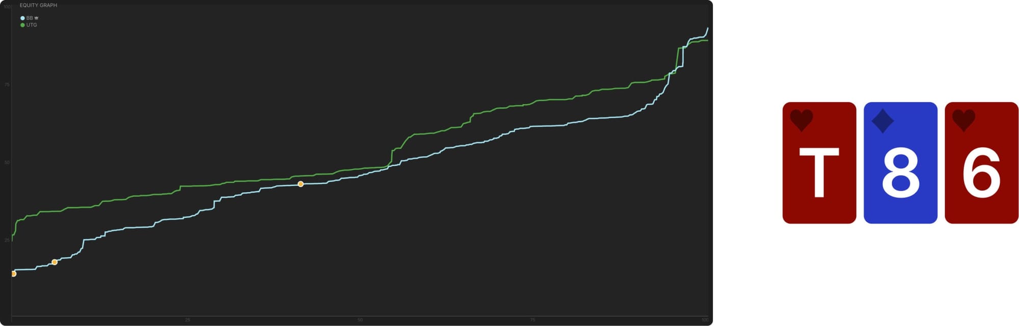
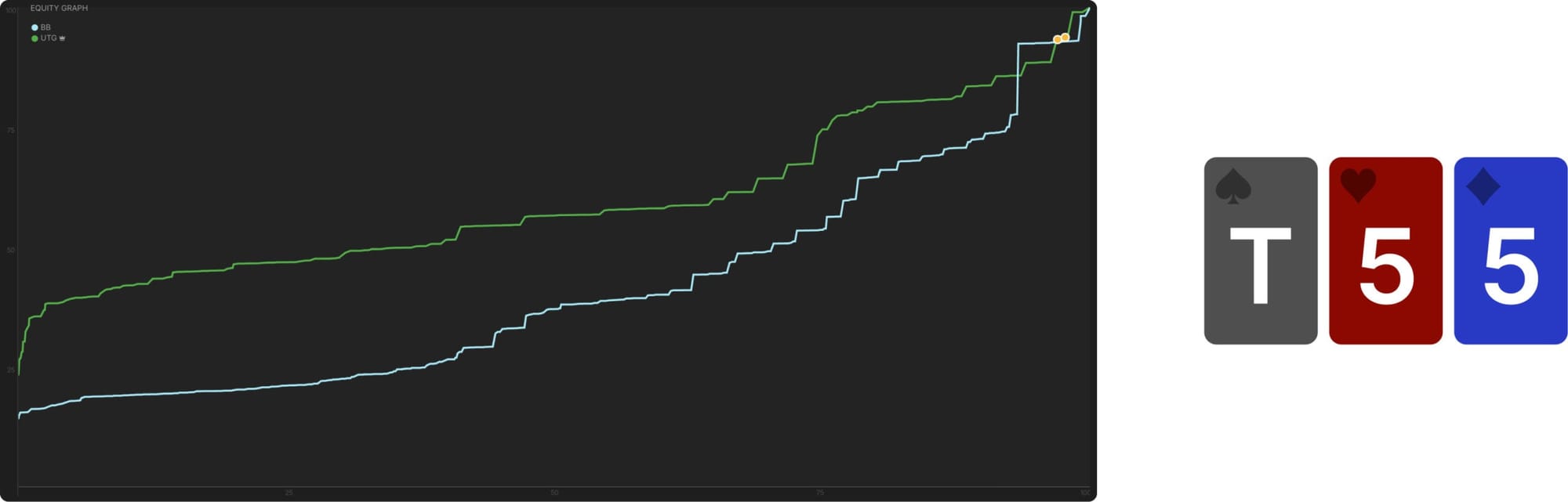
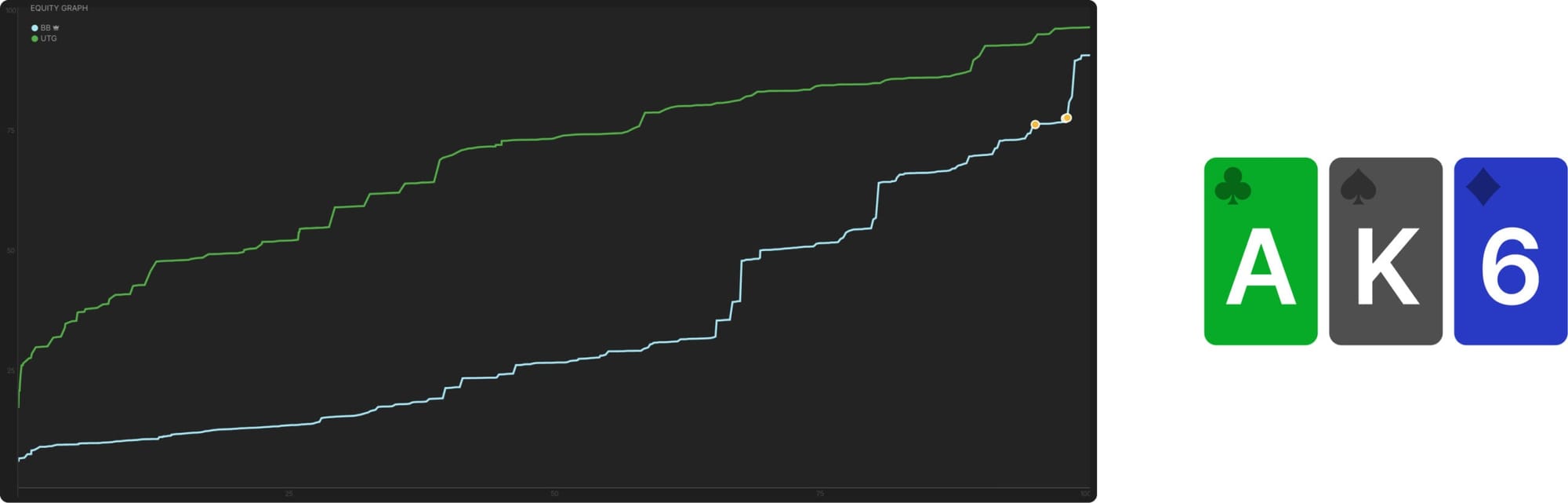
Now that you’re familiar with these graphs, let’s practice using them to evaluate flops. The following graphs depict the equity distributions for a single-raised pot, UTG vs BB, in a 100bb 6-max cash game on three very different flops: T55r, T86tt, and AK6r.
See if you can determine which graph depicts which flop. A few hints follow, in case you have trouble.
Hints
In the first graph, the equity is quite evenly distributed. BB’s hands are a bit weaker on average, but neither player enjoys a significant range advantage. Both players have the strongest possible hands in their ranges.
In the second graph, UTG’s range is noticeably stronger except at the top end. Around the 95th percentile of hands, the BB’s blue line actually surpasses UTG’s green line, suggesting BB is more likely to have the very strongest hands despite their overall equity disadvantage.
In the third graph, UTG has a huge equity advantage that persists across all segments of hand strength. Their weakest hands are much stronger than BB’s weakest hands, their medium hands are much stronger than BB’s medium hands, and their strongest hands are moderately stronger than BB’s strongest hands.
Answers
{{toggle: First Graph}}
The first graph is the T86tt flop. Flops with three medium cards give BB the best opportunity to catch up to UTG’s stronger preflop range, especially when there are also straight and flush draws possible. Neither player has tremendous incentive to grow the pot, but BB still suffers a positional disadvantage along with a slight equity disadvantage. So they check their entire range on the flop, but UTG continuation bets just 44%, which is quite low for an UTG vs BB spot. These bets are mostly small, 33% or 50% of the pot, pressuring the weakest part of the range, where UTG’s advantage is greatest.
{{/toggle}}
{{toggle: Second Graph}}
The second is the T55r flop. Offering no straight or flush draws and only two cards to match, this flop makes it quite difficult for BB to flop equity. UTG enjoys a significant range advantage but must be careful, because while the BB has many weak hands in their range, they are also more likely to have trips. For this reason, UTG continuation bets only about 50%, which is low considering the magnitude of their equity advantage and the dynamism of the board. Again, UTG’s preference is for small bets, because their weaker hands are ahead of BB’s weaker hands, an advantage they will not enjoy if the pot becomes too large and ranges too strong.
BB also does some donk betting on this flop, with about 20% of their range. Their nuts advantage incentivizes them to start forcing some money into the pot and deny UTG the opportunity to pot control.
{{/toggle}}
{{toggle: Third Graph}}
The third graph is AK6r, one of the worst flops for BB. While they can flop middle or even top pair fairly easily (notice the two “shelves” on their blue line where their hands abruptly gain a lot of equity), even these hands pale in comparison to UTG’s best hands. BB never has AA or KK and only rarely AK, while all these are in UTG’s range at full frequency. To capitalize on this range advantage, UTG continuation bets their entire range, often for a large size: 124% pot is their most common bet size.
{{/toggle}}
Conclusion
By studying these graphs, we can glean a lot about which player has more of which kind of hand and, consequently, how large of a pot that player will prefer to play. These preferences drive betting frequency and sizing. Considering these same factors in-game and visualizing what these graphs would look like in a given situation can help you make better decisions about whether and how much your range will prefer to bet.
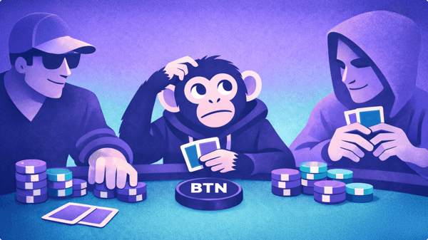
Monkey in the Middle: 3-Way Pot Heuristics
In this article, we will discuss the key strategic differences between this scenario and one where you face a continuation bet in a heads-up pot, how those differences factor into the GTO responses to these bets in 3-way pots, and when those differences are more or less salient.

The Trouble With Implied Odds
When we were brand new to poker strategy, many of us learned about concepts like equity, outs, and pot odds. When drawing, we were taught to count our outs, use those to estimate our equity, and then call or fold based on whether we were getting the right pot odds for the equity we had.
Poker Concepts You’re Using Wrong (and How They’re Hurting Your Winrate)
Language and poker are two of my great passions in life, so I’ve always been interested in poker’s unique and colorful vocabulary. As a poker coach, podcaster, and writer, I have particularly strong opinions about the language we use to explain poker strategy.